

Case STudy ROCK INVESTMENTS LTD.
Rock Investments is a specialized memorabilia business at the intersection of history, investment, and purpose. They curate authenticated, high-value pieces that preserve iconic moments and cultural milestones while supporting vulnerable children and foster families through foster care and adoption.
They came to me to build their brand from the ground up. The opportunity wasn’t to “look better” than competitors, it was to create a story-led, trust-first brand that feels exclusive and timeless in a market that often looks transactional, noisy, and hype-driven.
The goal was to create a brand that elevates memorabilia into legacy: credible enough for serious buyers, human enough to move people, and purpose-driven enough to mean something beyond the collection.
GOALS:
Stand out from transaction-based brands
Incorporate legacy/purpose
Highlight storytelling
Make it feel exclusive and nostalgic
SOLUTION
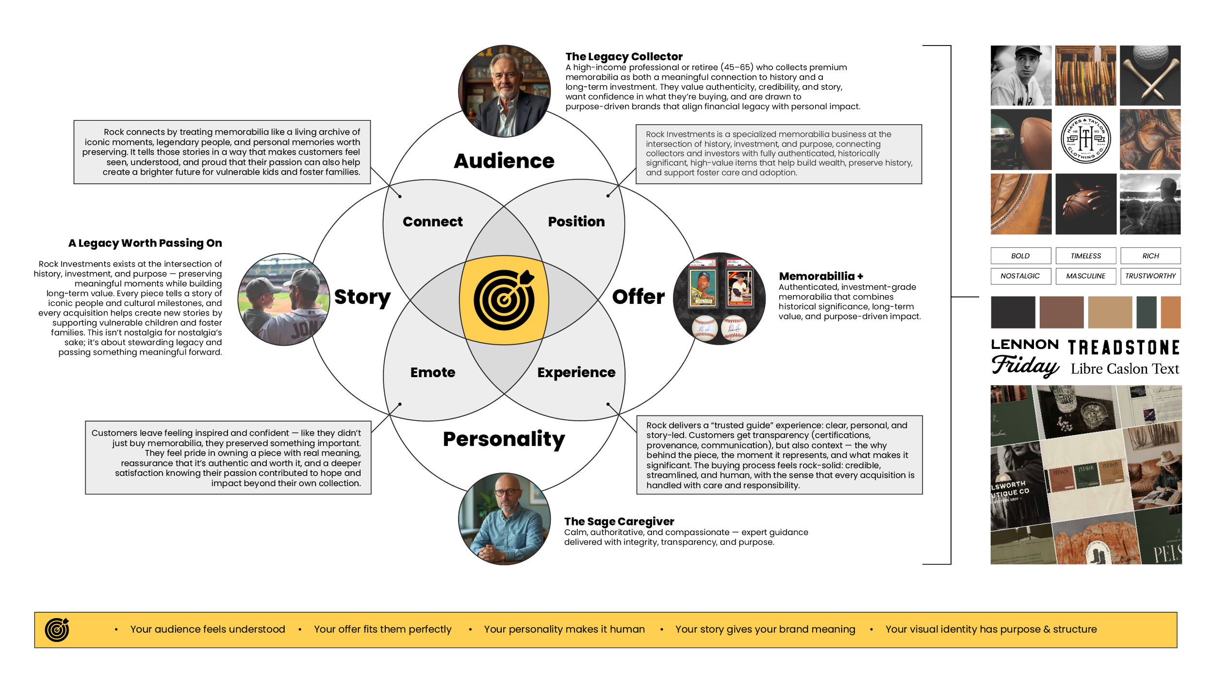
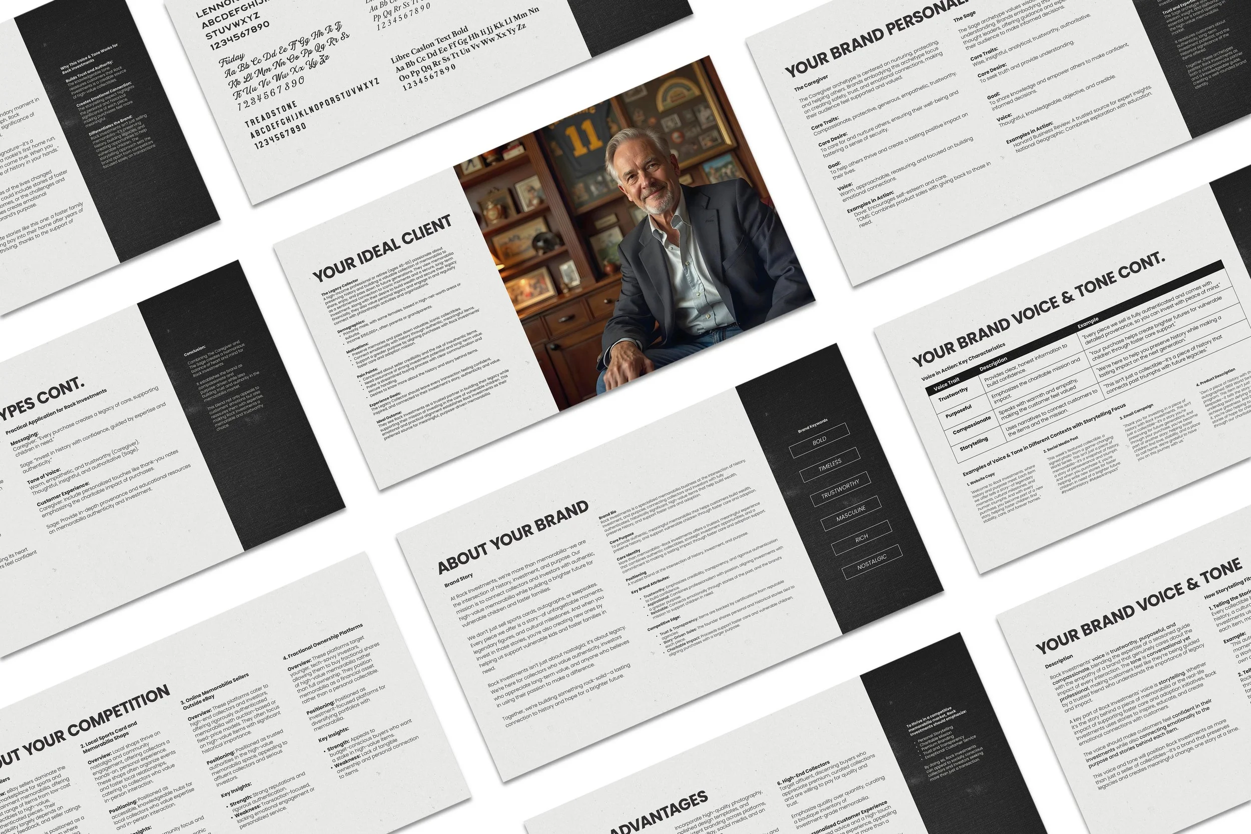
We began by using the Brand Blueprint to define Rock Investment’s foundation: the Legacy Collector they serve, the curated and authenticated memorabilia they offer, the Sage + Caregiver personality that leads with calm authority and real care, and a story rooted in the belief that every piece carries meaning worth preserving.
Together, those elements revealed the strategic direction for a brand built on more than products: history, responsibility, trust, and impact. The story couldn’t be an “about us” paragraph. It had to be the point. The brand needed to feel like a trusted steward of history, not a reseller.
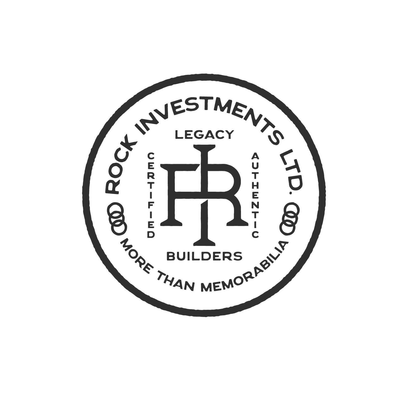
Six words were used to define the overall visual direction:
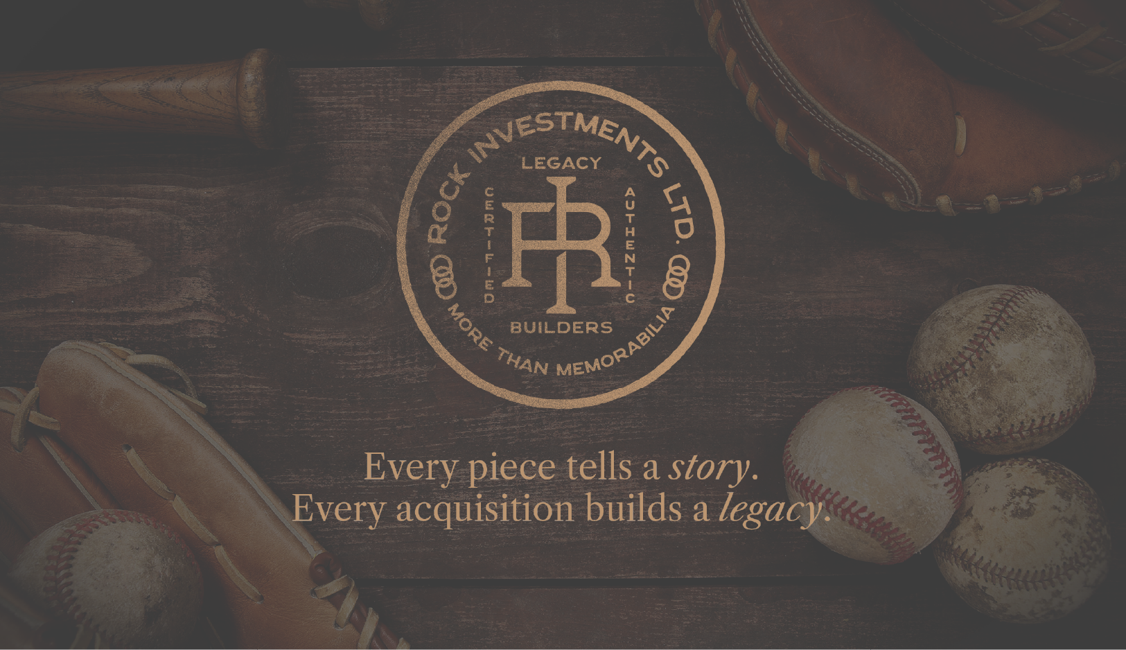
Bold, Nostalgic, Timeless, Masculine, Rich, Trustworthy
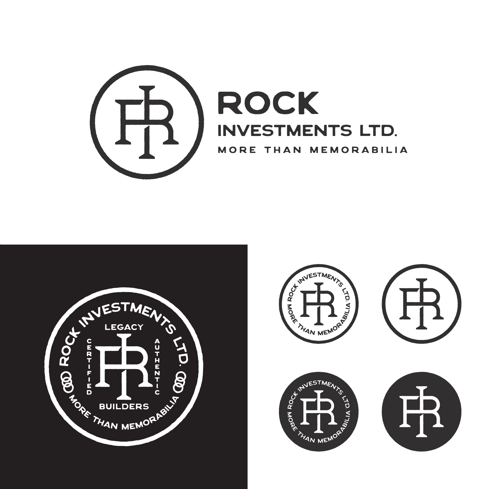
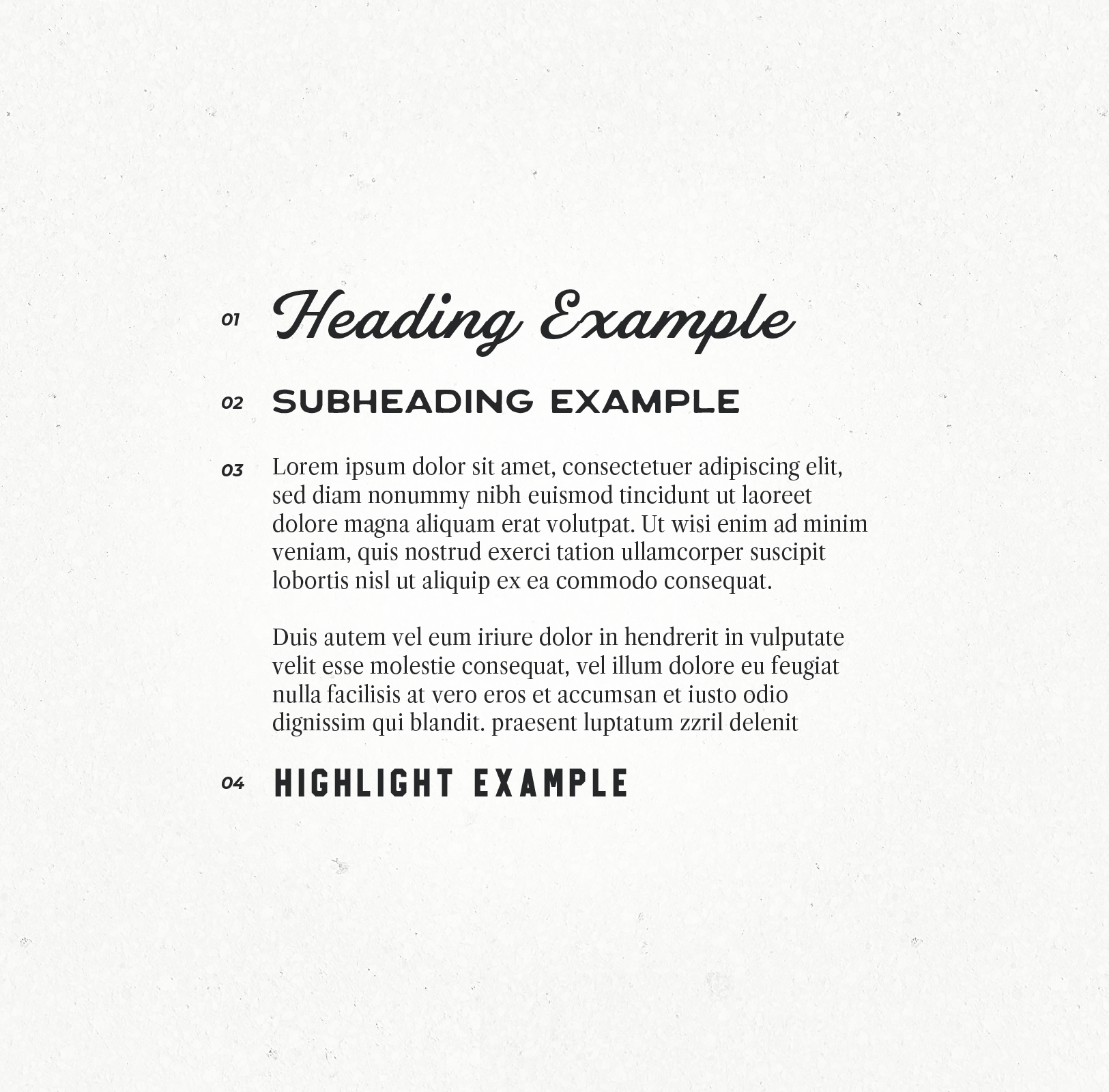
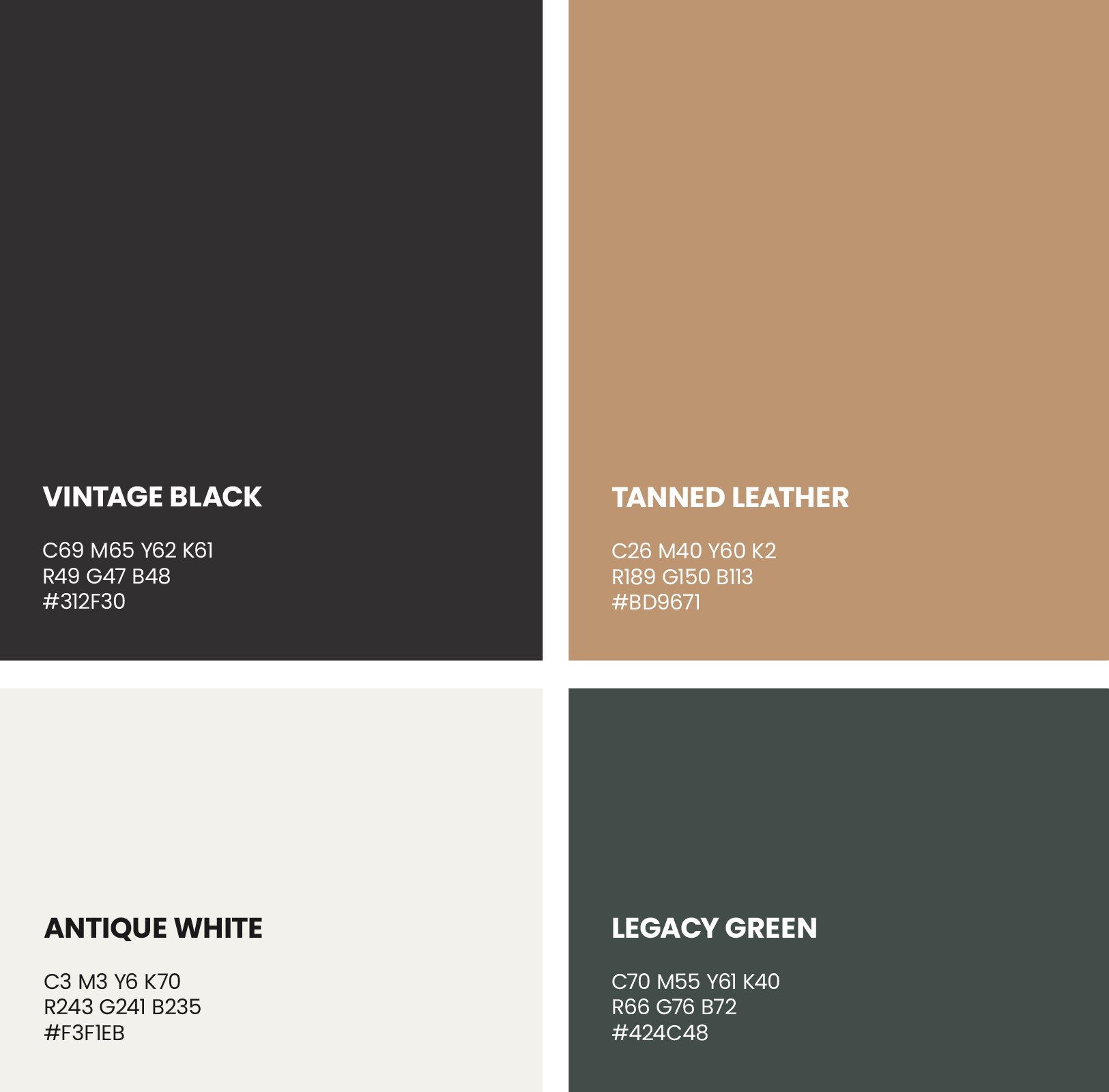
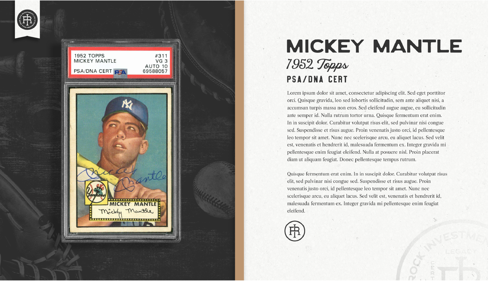
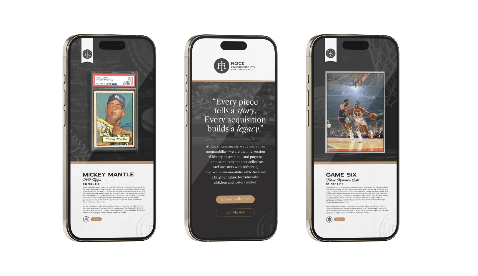
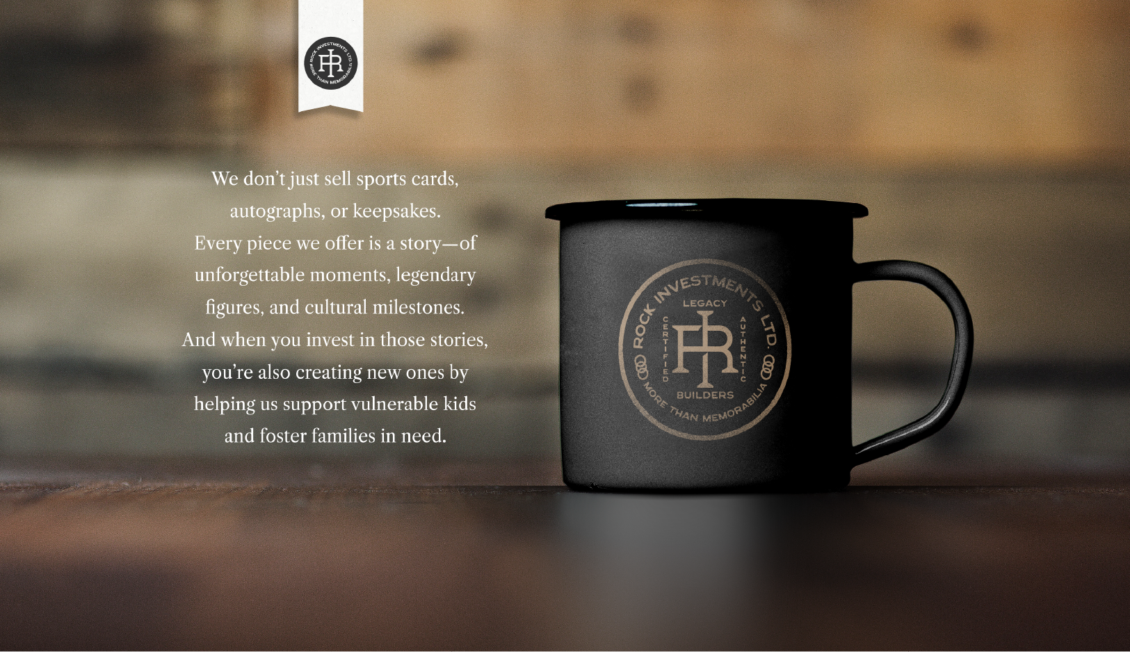
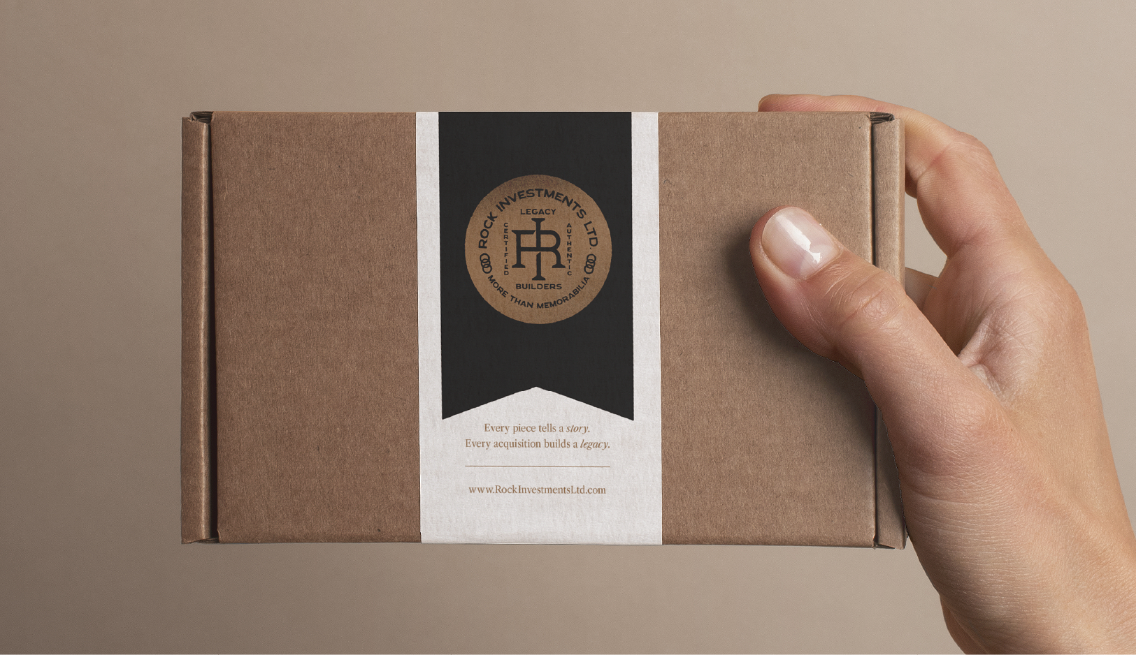
Visually, we created a system that feels vintage and premium without becoming flashy or trendy. A classic, understated identity paired with warm heritage textures and disciplined typography gives Rock the credibility of an established brand from day one. The tone and messaging bring the human layer forward, framing each acquisition as a story, a legacy-building decision, and a way to contribute to something bigger than ownership.
The result is a brand that doesn’t just sell memorabilia. It elevates it. Rock Investments shows up as a purpose-driven, story-led, trust-first brand that feels exclusive, meaningful, and rock-solid.
Rock Investments went from an idea to a fully formed brand built to earn trust, create emotion, and turn collectors into legacy builders.

RESULT
A clear brand story that turns memorabilia into meaning, legacy, and impact
A premium, nostalgic identity that feels established, exclusive, and trustworthy from day one
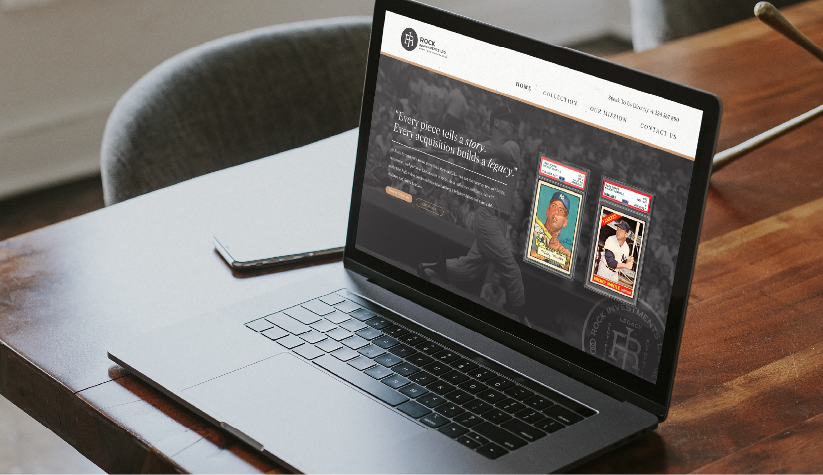
A cohesive brand system ready for web, social, packaging, and sales conversations
Ready for a strategic, stand-out brand of your own?