

Case STudy Payson Christian School
Payson Christian School is a small but growing private school in the small town of Payson, Arizona. They came to me looking to modernize their logo and develop a modern, flexible brand that would work across uniforms, signage, social media, print, and digital platforms, and that their internal team could apply consistently without confusion or guesswork.
CHALLENGES:
Outdated logo that was difficult to reproduce
Single layout with no flexibility across applications
Inconsistent visuals due to lack of a structured system
Identity that didn’t reflect the school’s bright, energetic learning environment
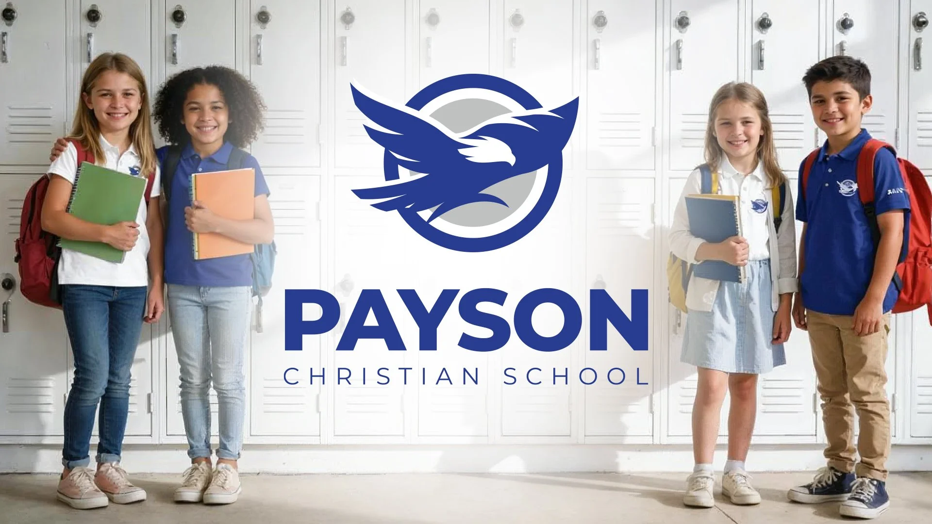
After
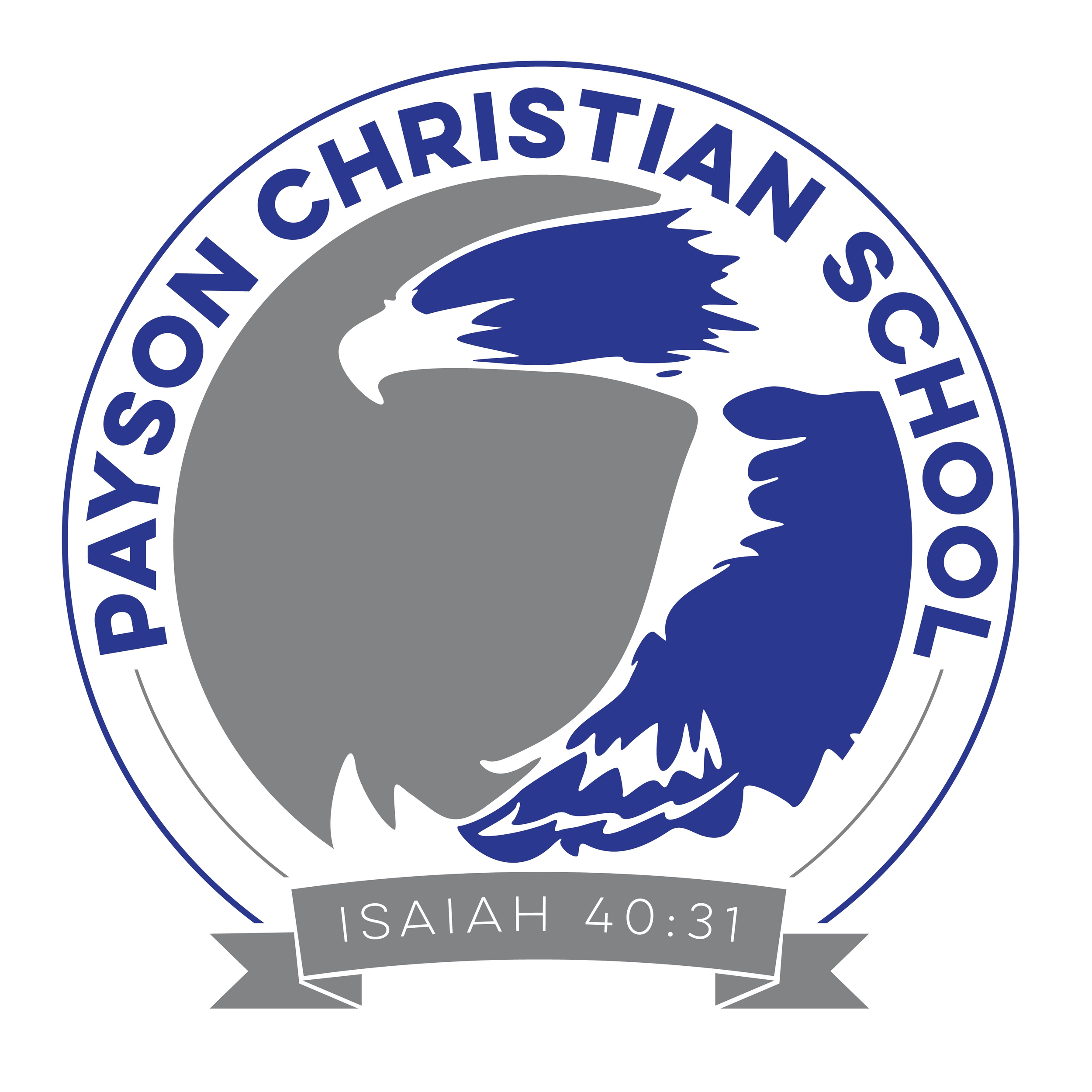
Before
SOLUTION
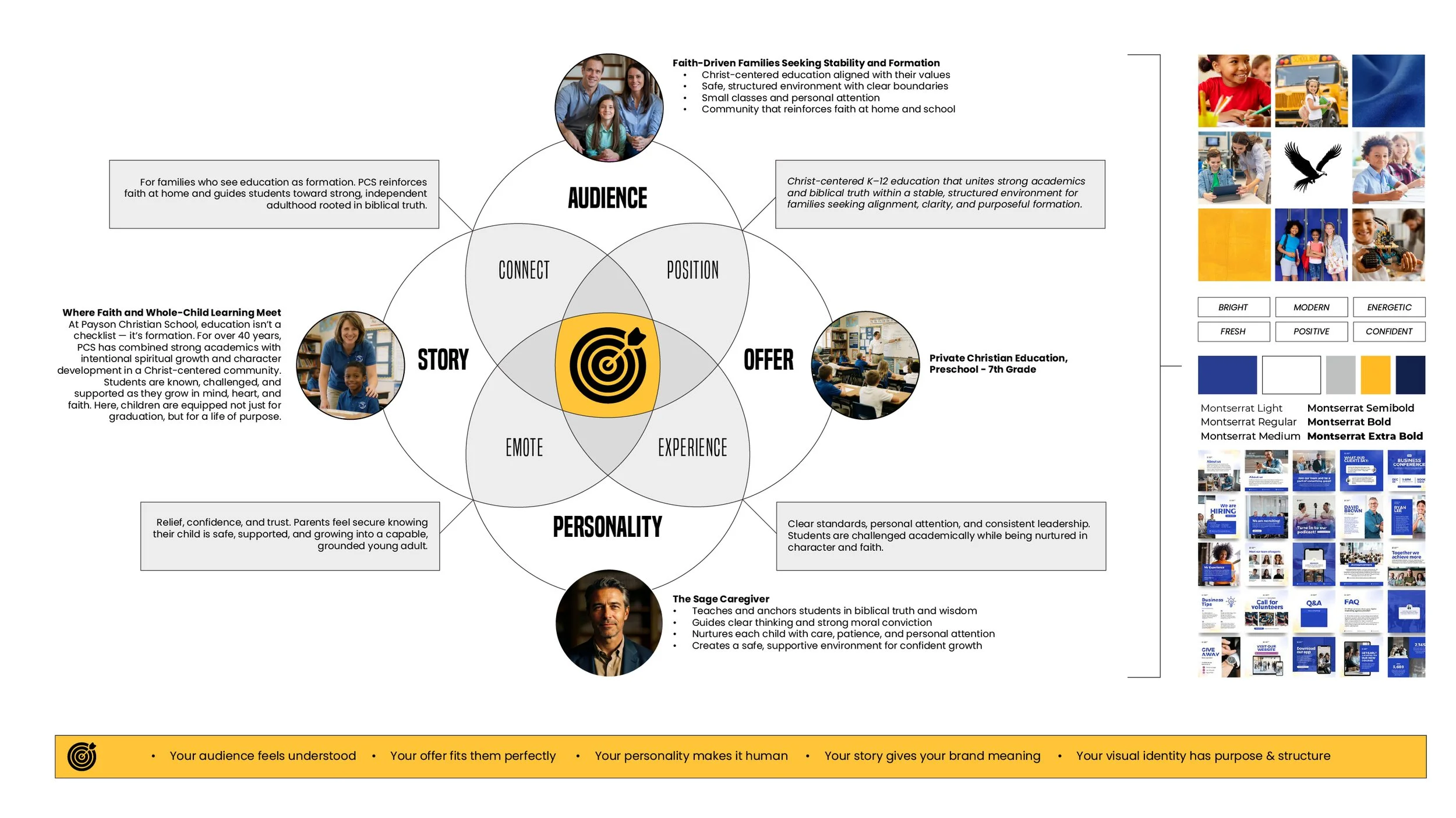
We started by using the Brand Blueprint to define the four core elements of Payson Christian School’s brand: the faith-driven families they serve who see education as formation, the Christ-centered K–12 offer that unites strong academics and biblical truth, the Sage-and-Caregiver personality that guides with wisdom and nurtures with care, and a brand story centered on clarity, confidence, and preparing students for strong, independent adulthood.
Six words were used to define the overall visual direction:
Bright, Modern, Energetic, Fresh, Positive, Confident
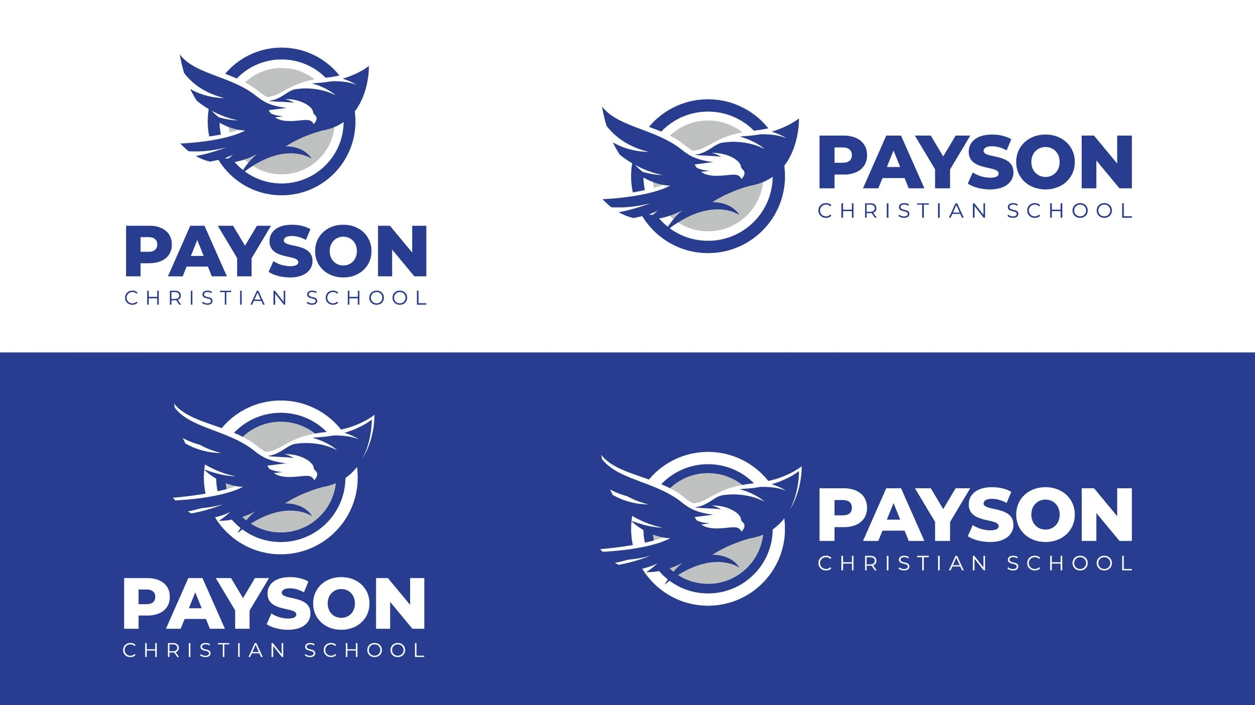
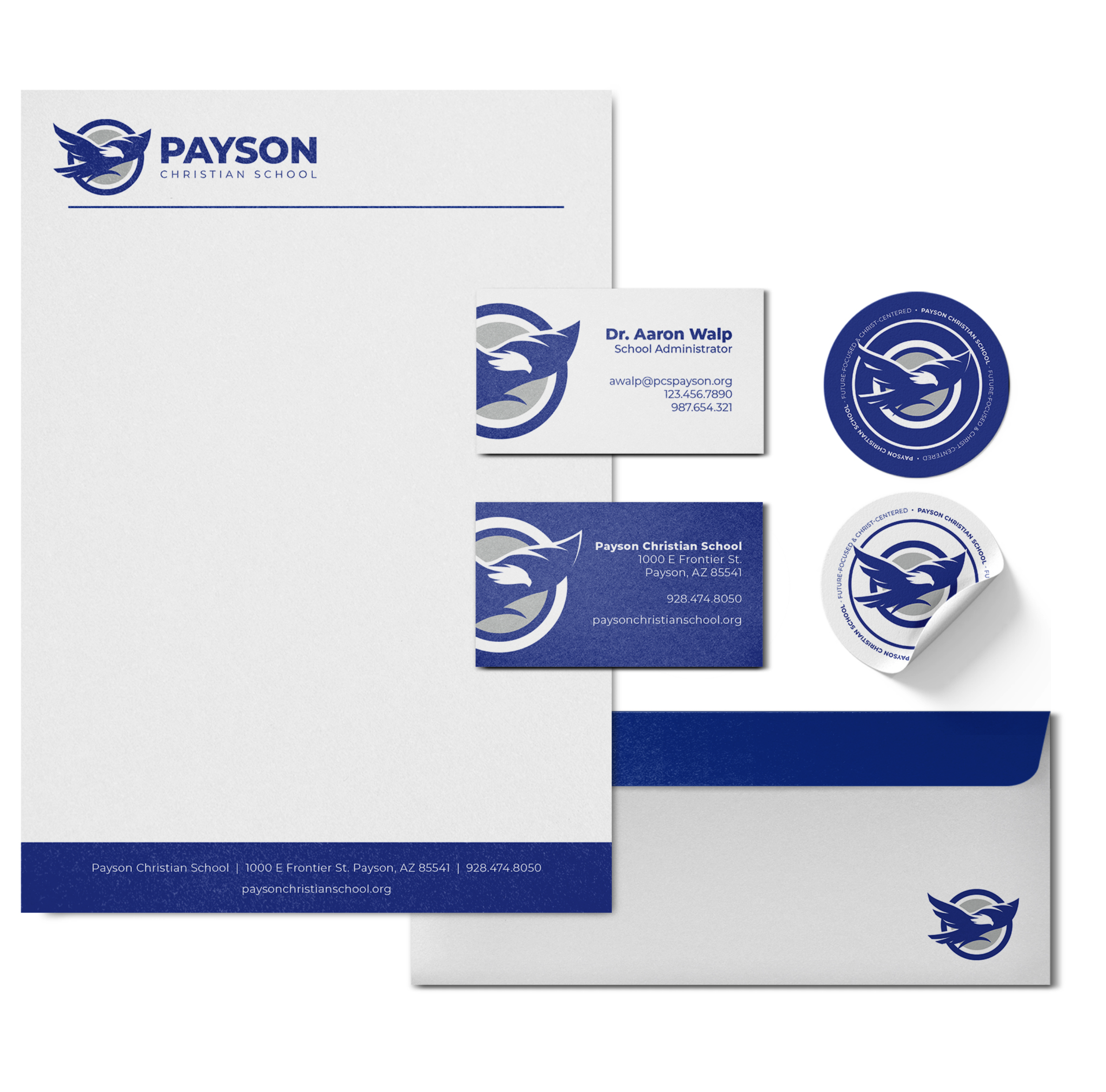
Visually, we crafted a direction that reinforced Payson’s identity. A bold, simplified eagle paired with a clean, modern sans serif wordmark communicates strength, clarity, and confidence.
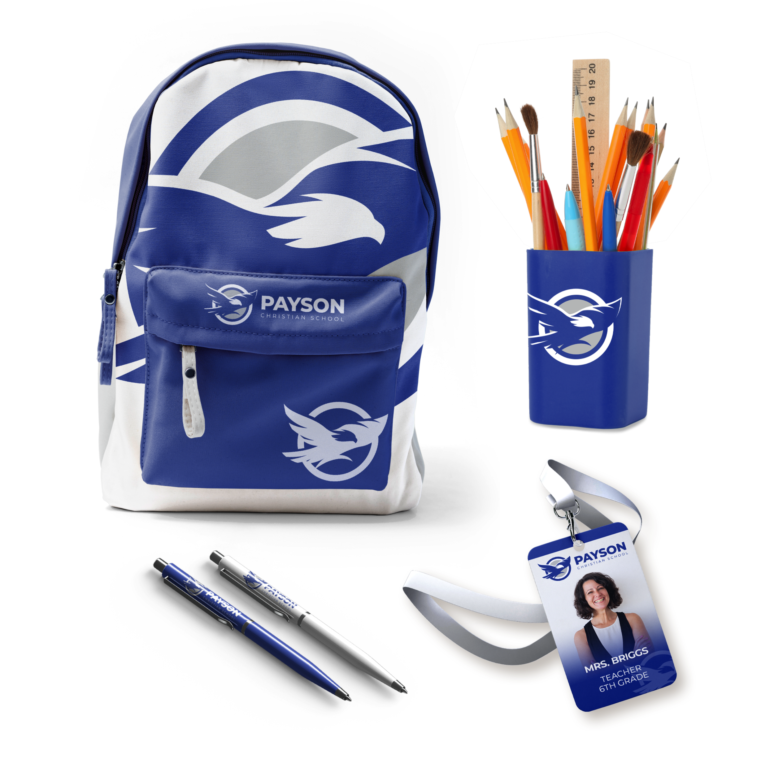
Flexible logo variations, a standalone brandmark, and one-color options ensure the system adapts seamlessly across print, apparel, signage, and digital platforms.
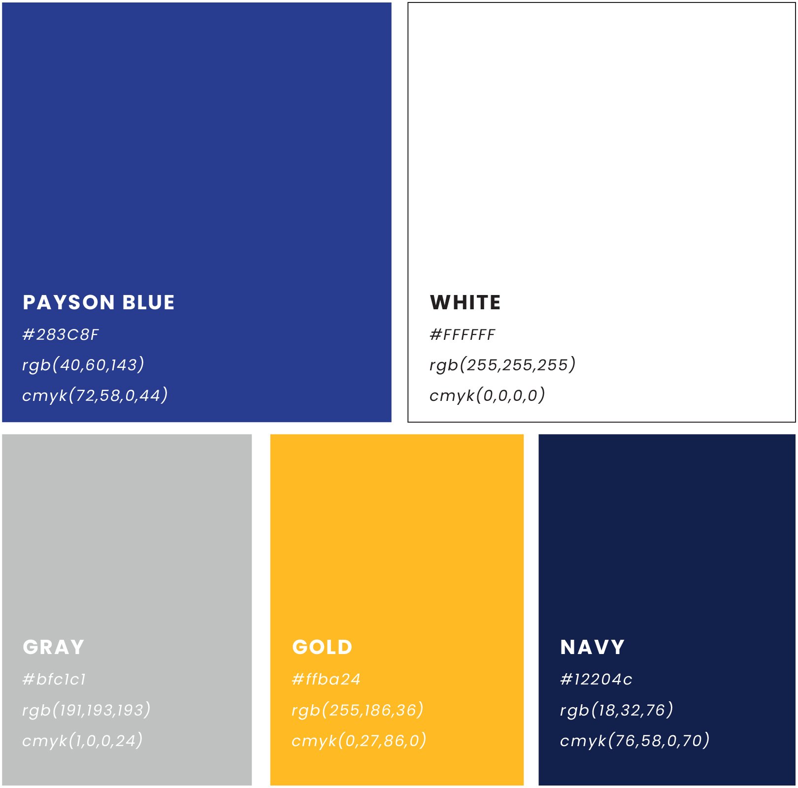
The palette centers on Payson blue and white with gold accents for energy and focus, while a streamlined typography system makes implementation simple for staff. A custom icon set was developed to support the brand, including academic, faith, athletics, arts, STEM, leadership, and growth symbols, each designed with strong outlines and crisp shapes for clarity and consistency.
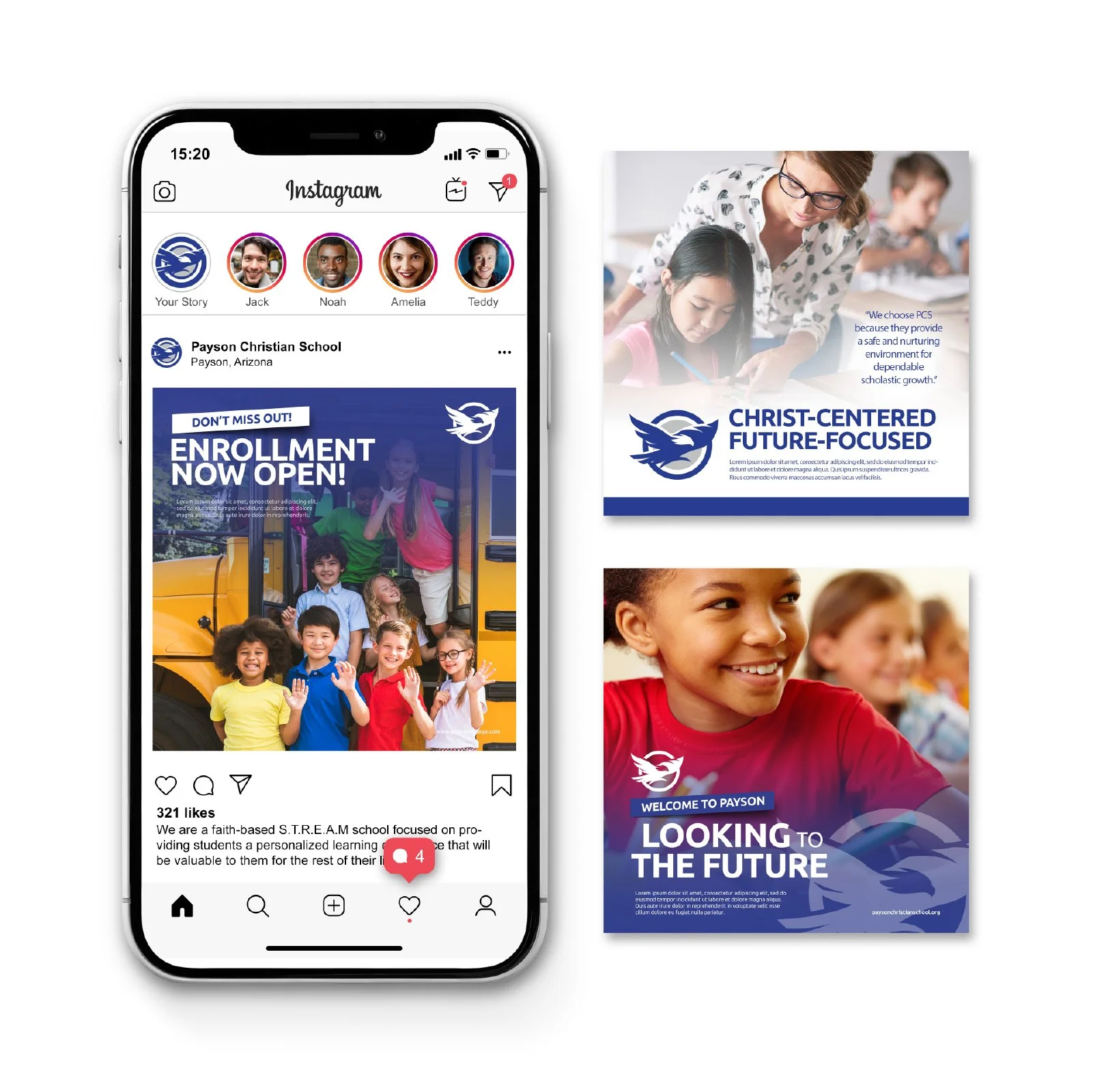
Photography shifted to bright, student-focused imagery that highlights active learning, diversity, technology, and forward momentum.
The result is a bright, future-focused brand identity that reflects the energy, clarity, and confidence of the education Payson Christian School provides. Instead of looking dated and limited, the school now presents itself with a modern, cohesive presence that matches the strength of its academics and faith foundation, making it the clear and confident choice for families seeking Christ-centered formation.
Payson Christian School went from an outdated, inflexible identity to showing up with a bright, modern, and confidently structured brand that finally matches the strength of its academics and the clarity of its mission.


RESULT
A clear, faith-centered brand story that positions Payson as formation, not just education
A bright, modern identity that reflects the strength of its academics and the confidence of its mission
A unified, flexible brand system ready for real-world use across uniforms, print, campus materials, and digital platforms
Ready for a strategic, stand-out brand of your own?