Case STudy Greenway Landscape Supply
Greenway Landscape Supply is a full-service landscape partner serving upscale homeowners in Southwest Florida. They help customers move from idea to finished outdoor space by combining expert guidance, premium materials, and in-house installation, whether the homeowner wants to do it themselves or have everything handled for them.
They came to me at a point where the business itself was working, but the brand wasn’t pulling its weight. Their identity felt amateur, inconsistent, and didn’t reflect the quality of their products or services. They wanted to do more than just refresh the logo. They wanted to clarify their position and build a complete brand system that would communicate their value and stand out from their competitors.
CHALLENGES:
An identity that looked amateur/DIY
No clear positioning
Inconsistent visuals and messaging across signage, vehicles, print, and digital
No strong reason for customers to choose them over competitors
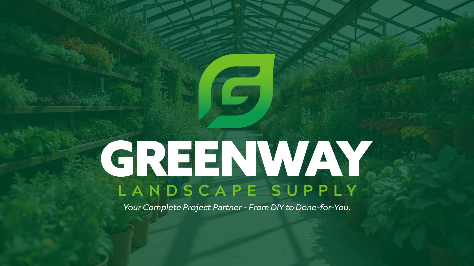
After
Before
SOLUTION
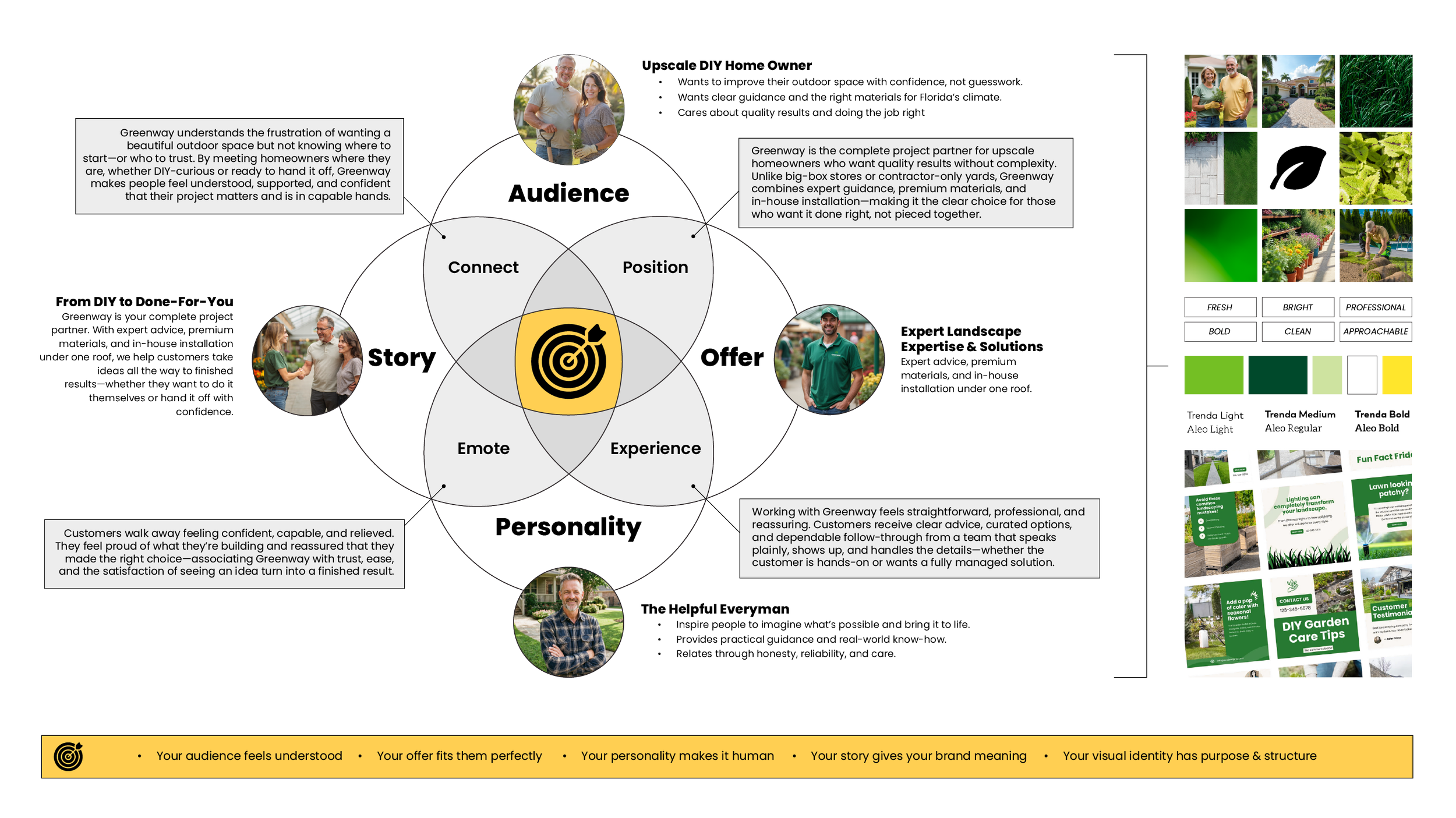
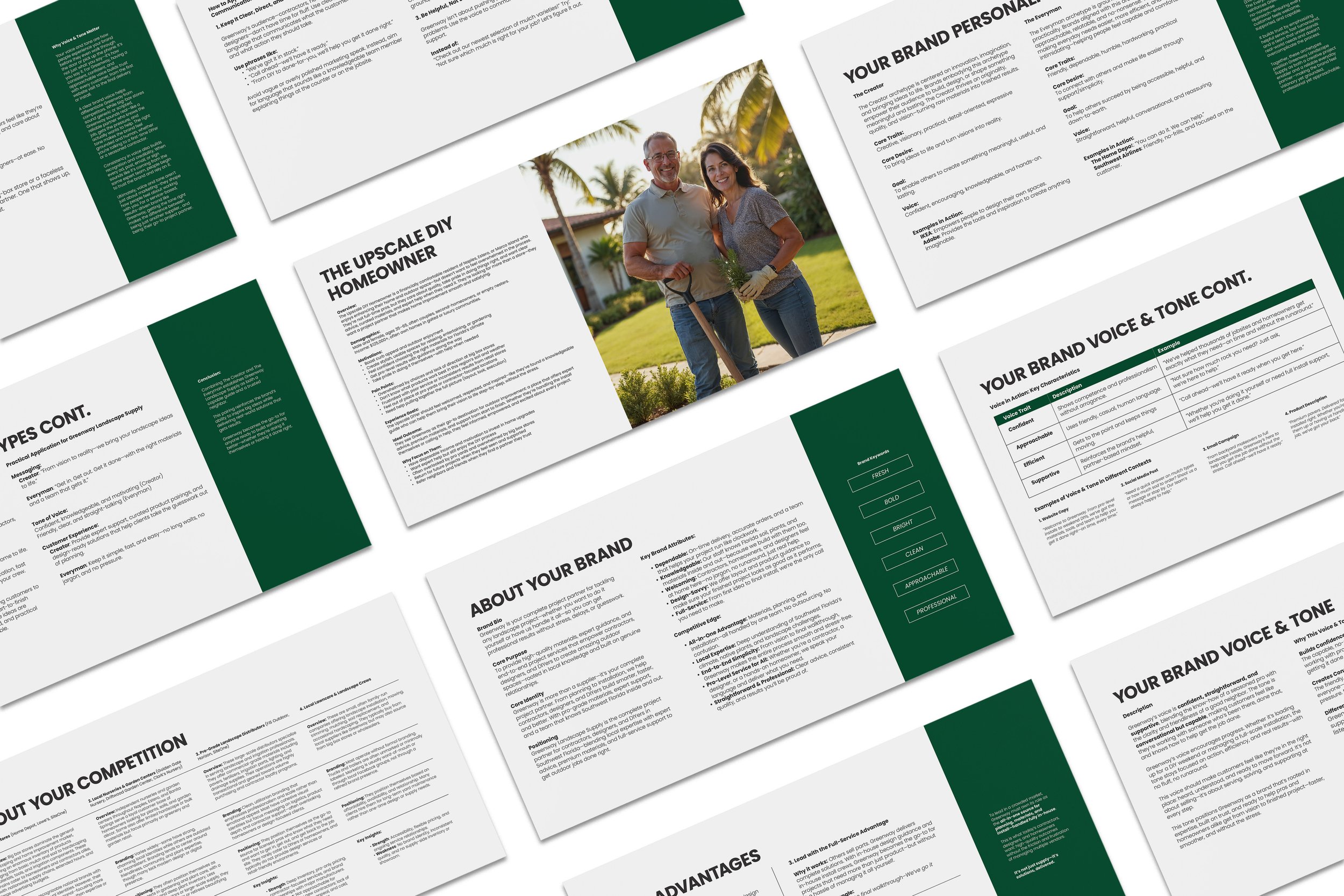
We started by using the Brand Blueprint to define the four core elements of Greenway’s brand: the upscale DIY homeowner they serve, the all-in-one offer that combines design, materials, and installation, the approachable and knowledgeable personality of the team, and a brand story centered on confidence, clarity, and getting projects done right.
That foundation revealed a clear strategic direction: Greenway isn’t just selling mulch, plants, or pavers, they’re selling confidence. Confidence to start a project, confidence to make the right choices, and confidence that the final result will look as good as imagined.
Six words were used to define the overall visual direction:
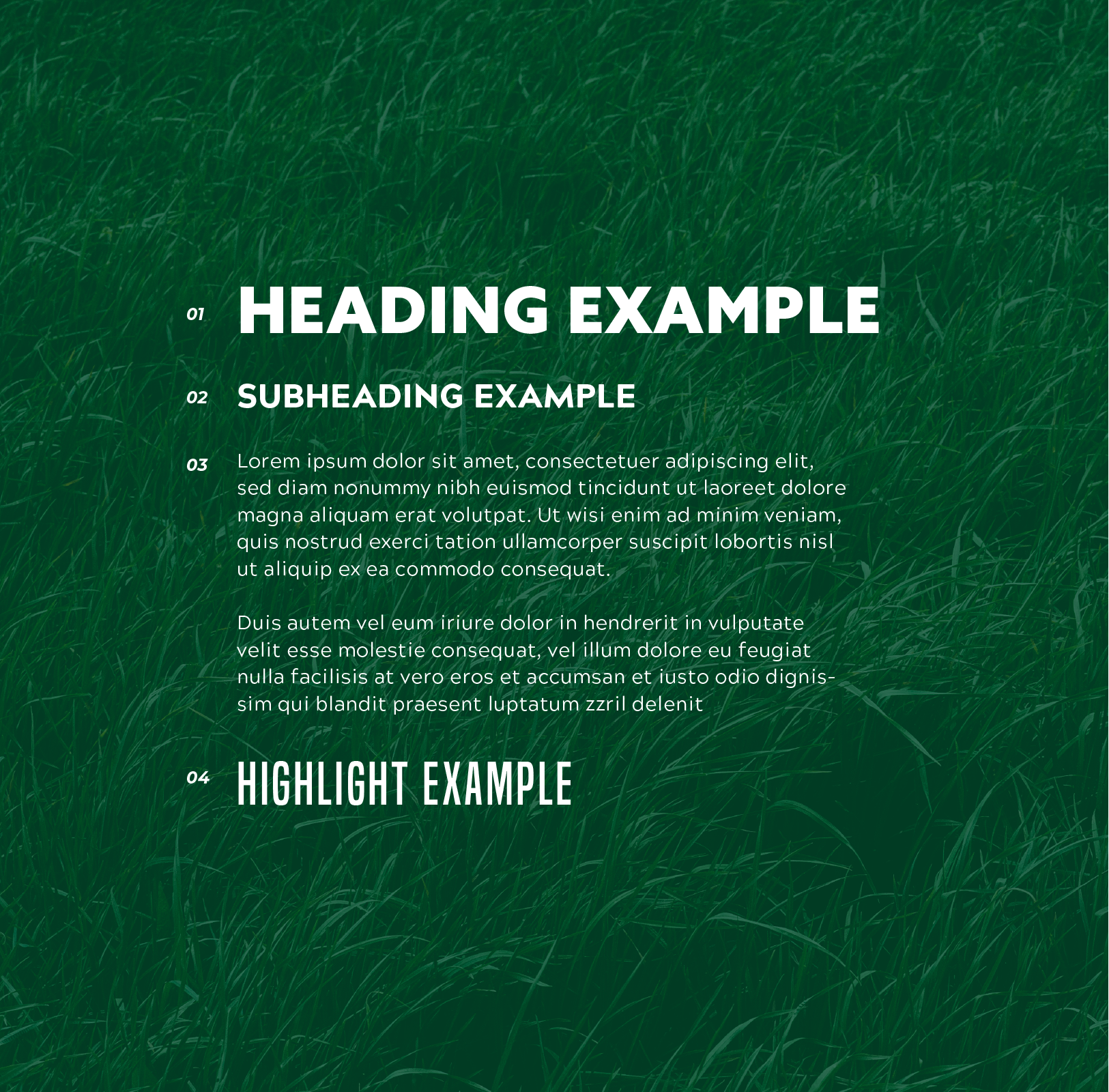
Fresh, Bold, Bright, Clean, Professional, Approachable
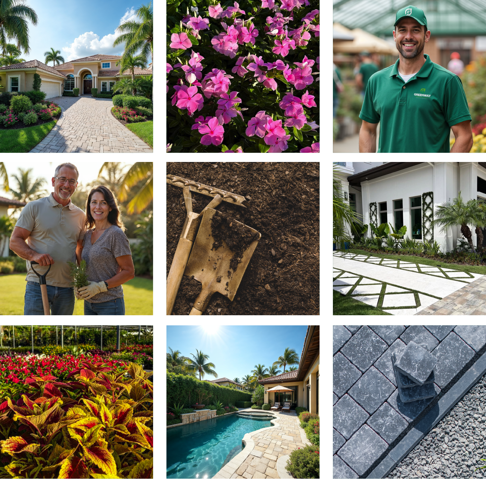
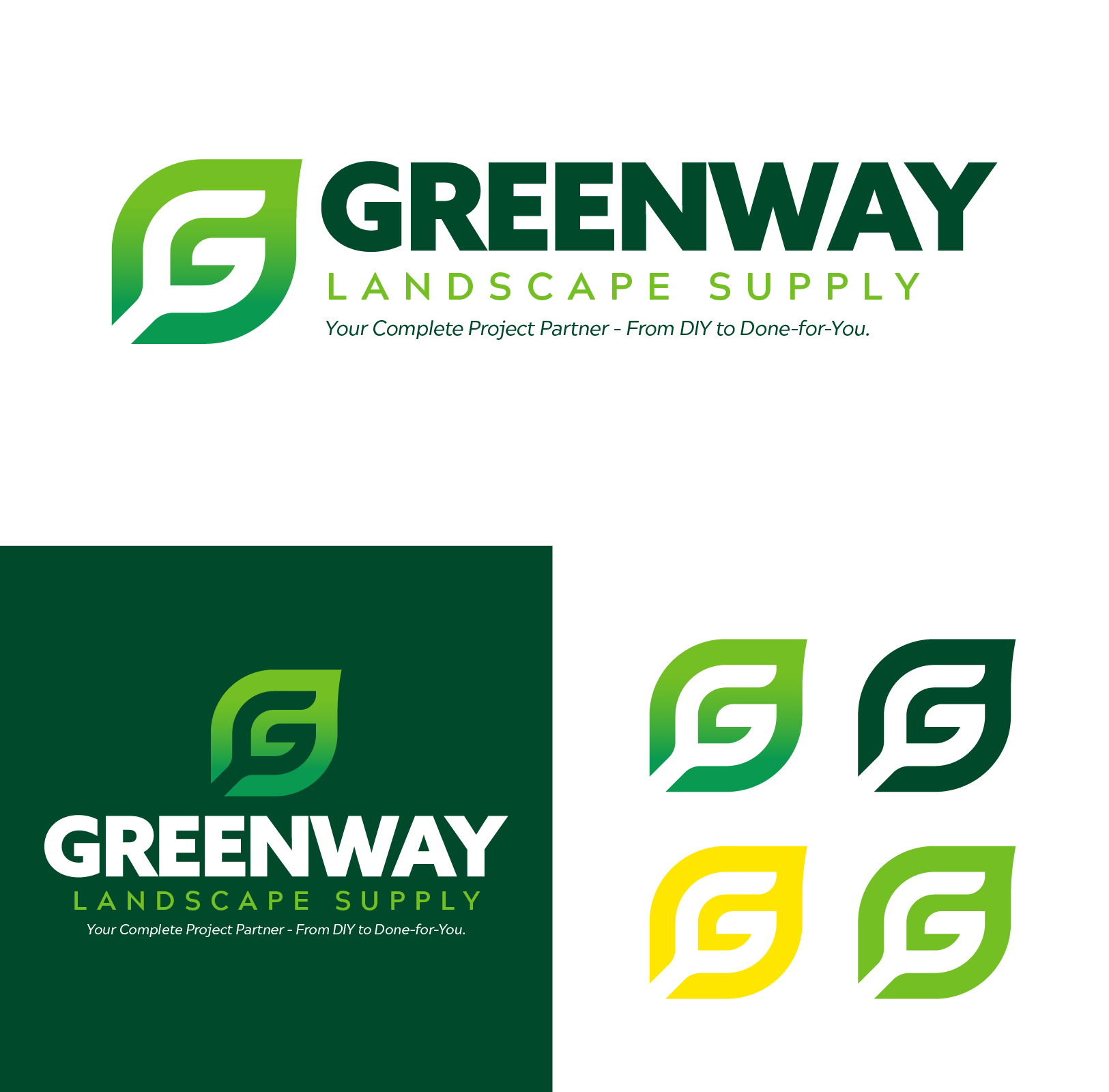
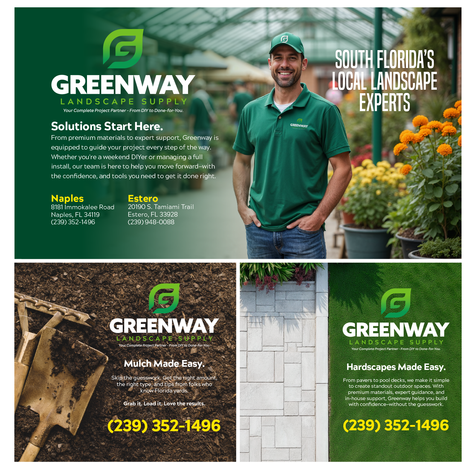
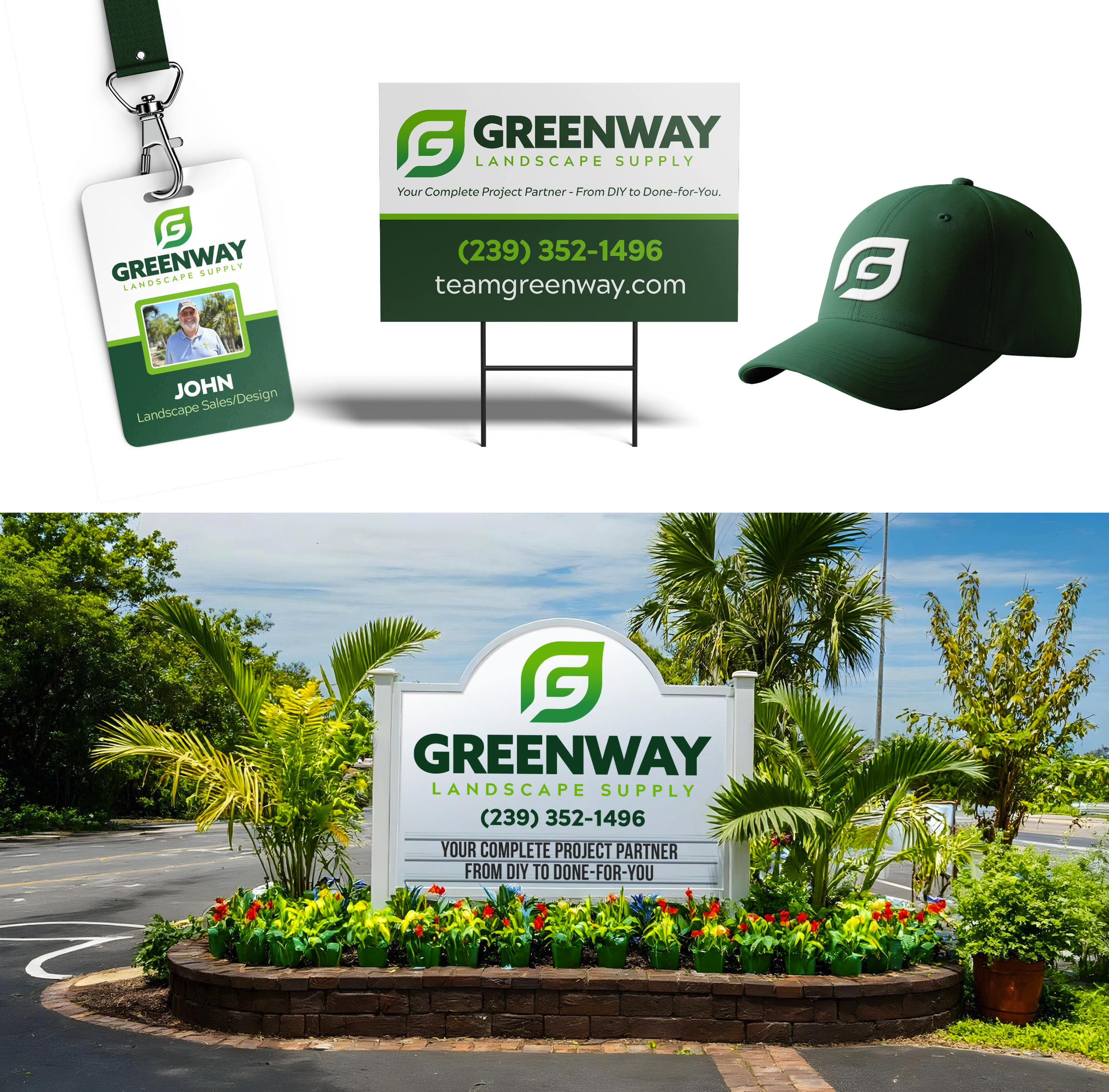
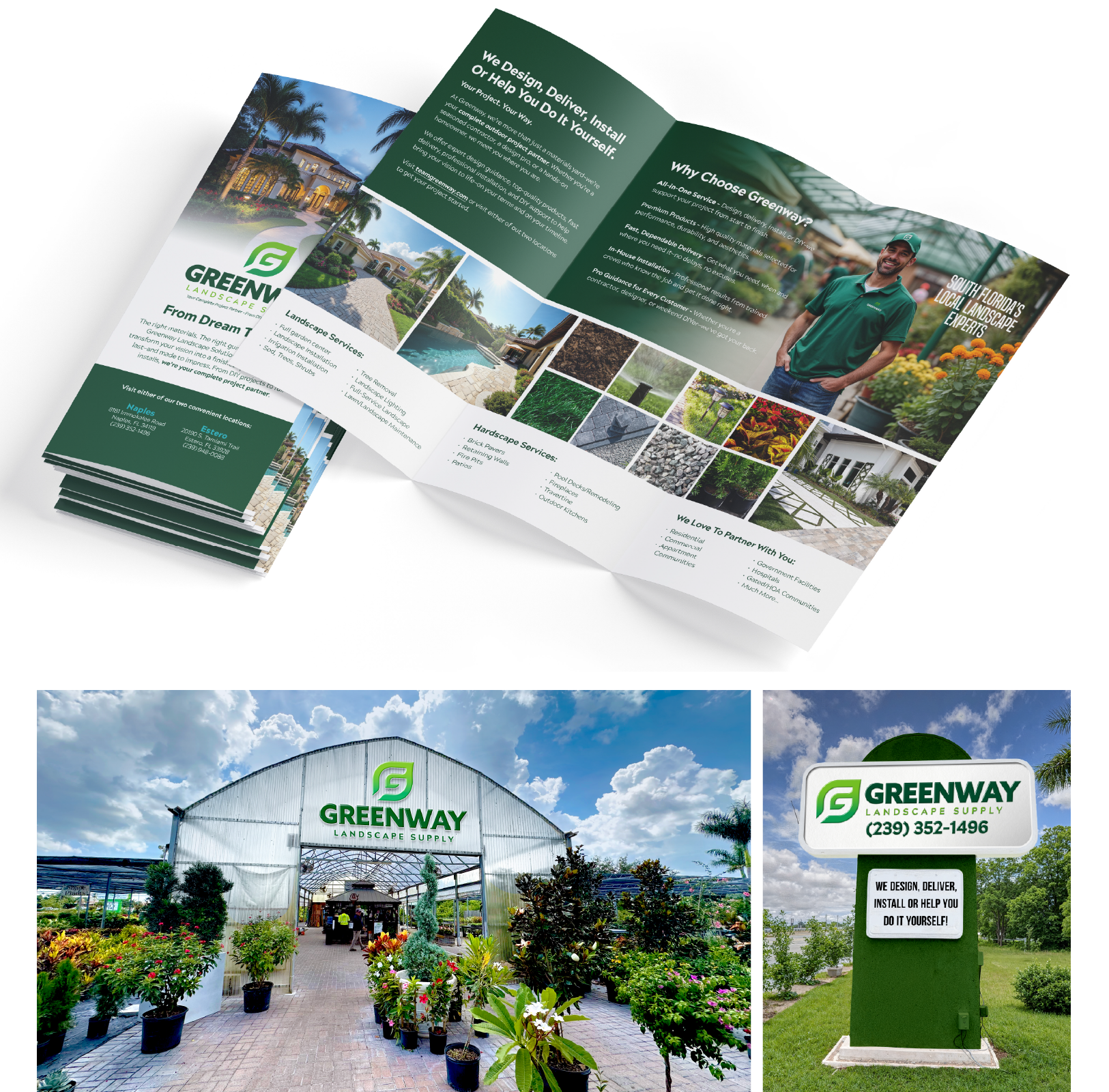
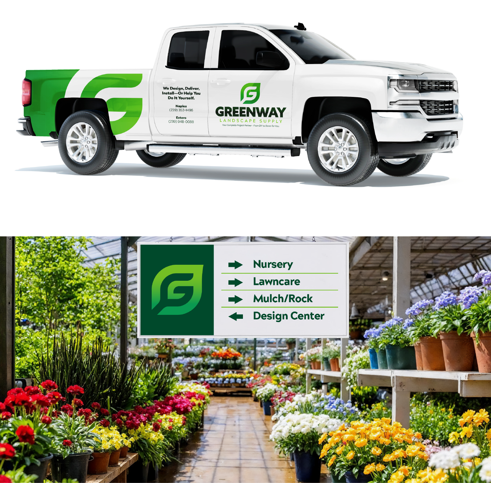
Visually, we built a system designed for real-world use. The new identity features a bold, modern mark that works across signage, vehicles, apparel, and digital platforms. A refined green palette reinforced growth, quality, and professionalism without feeling cold or corporate. Supporting graphics, photography, and layouts emphasized people, process, and finished results, making the brand feel human, capable, and dependable.
Messaging was simplified and sharpened to clearly communicate Greenway’s role as a partner, not just a supplier.
Language shifted away from product lists and toward outcomes, making it immediately clear how Greenway helps homeowners move from uncertainty to confidence.
Greenway Landscape Supply went from looking like just another small landscape supplier to standing out as the highly skilled, deeply knowledgeable, obvious choice for homeowners who want quality results without confusion, whether they’re hands-on or want it fully handled.
RESULT
A clearly positioned brand that communicates “complete project partner” at a glance
A professional, flexible identity system that works across yard signage, trucks, apparel, print, and digital
Consistent messaging that builds trust with first-time customers and reinforces confidence in the buying decision
Ready for a strategic, stand-out brand of your own?

