

AMP SAT Prep is a classroom-based SAT preparation program that helps high school students walk into test day confident, prepared, and ready to perform at their highest level. Led by experienced test prep specialists, AMP focuses on clear strategies and smart practice — not pressure or cramming.
They came to me during a pivotal transition, rebranding from 24Hundred to AMP (Achieving Maximum Potential). The goal wasn’t just a new name, but a complete repositioning: shifting from a traditional, scholarly, parent-focused test prep brand to a more student-first, engaging, and empowering identity that clearly stood apart from competitors in the space.
CHALLENGES:
Outdated logo design
Lacking flexibility/Single logo layout
Inconsistent branding due to lack of branding system
Messaging not aligned to their target audience
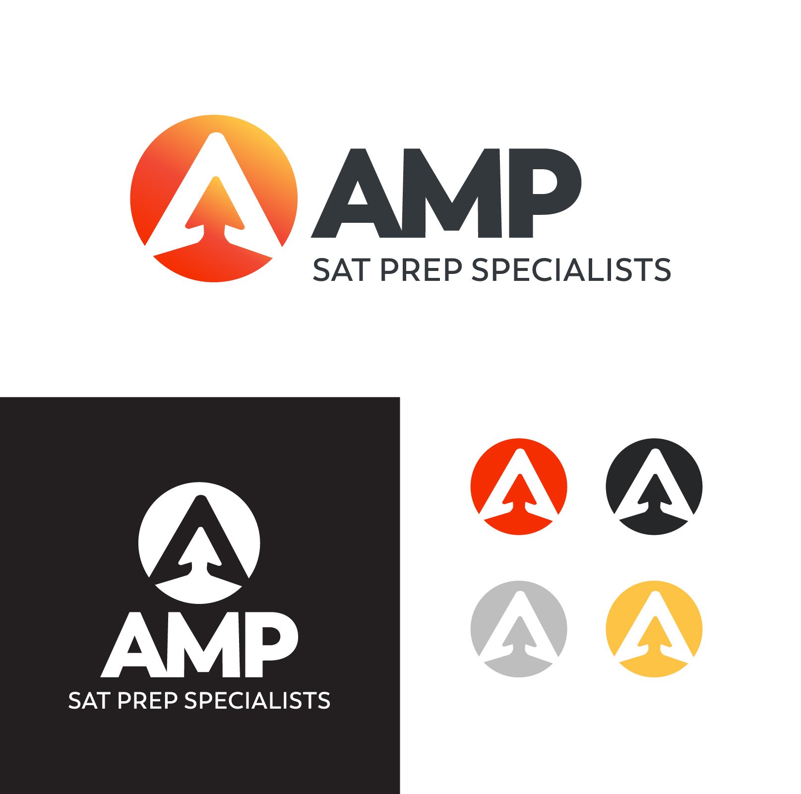
Case STudy AMP SAT PREP
After

Before

SOLUTION
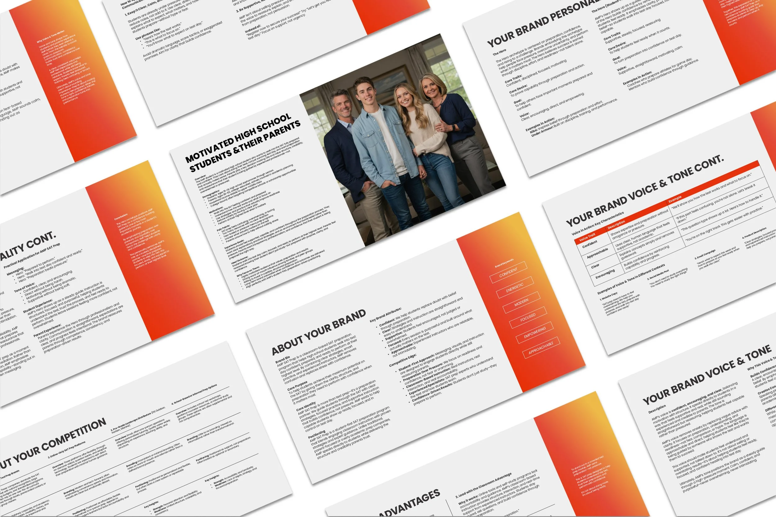
We began by using the Brand Blueprint to clearly define the four core elements of AMP SAT Prep’s brand: the motivated high school students they serve (with parents as key decision partners), the structured, classroom-based SAT preparation they provide, the confident and encouraging personality behind the instruction, and the brand story centered on the belief that the SAT is about preparation, not intelligence and that achieving maximum potential is possible with the right guidance.
Together, these elements revealed a strategic foundation for a brand built around confidence, clarity, readiness, and optimism, everything traditional, academic-looking test prep brands failed to communicate to students.
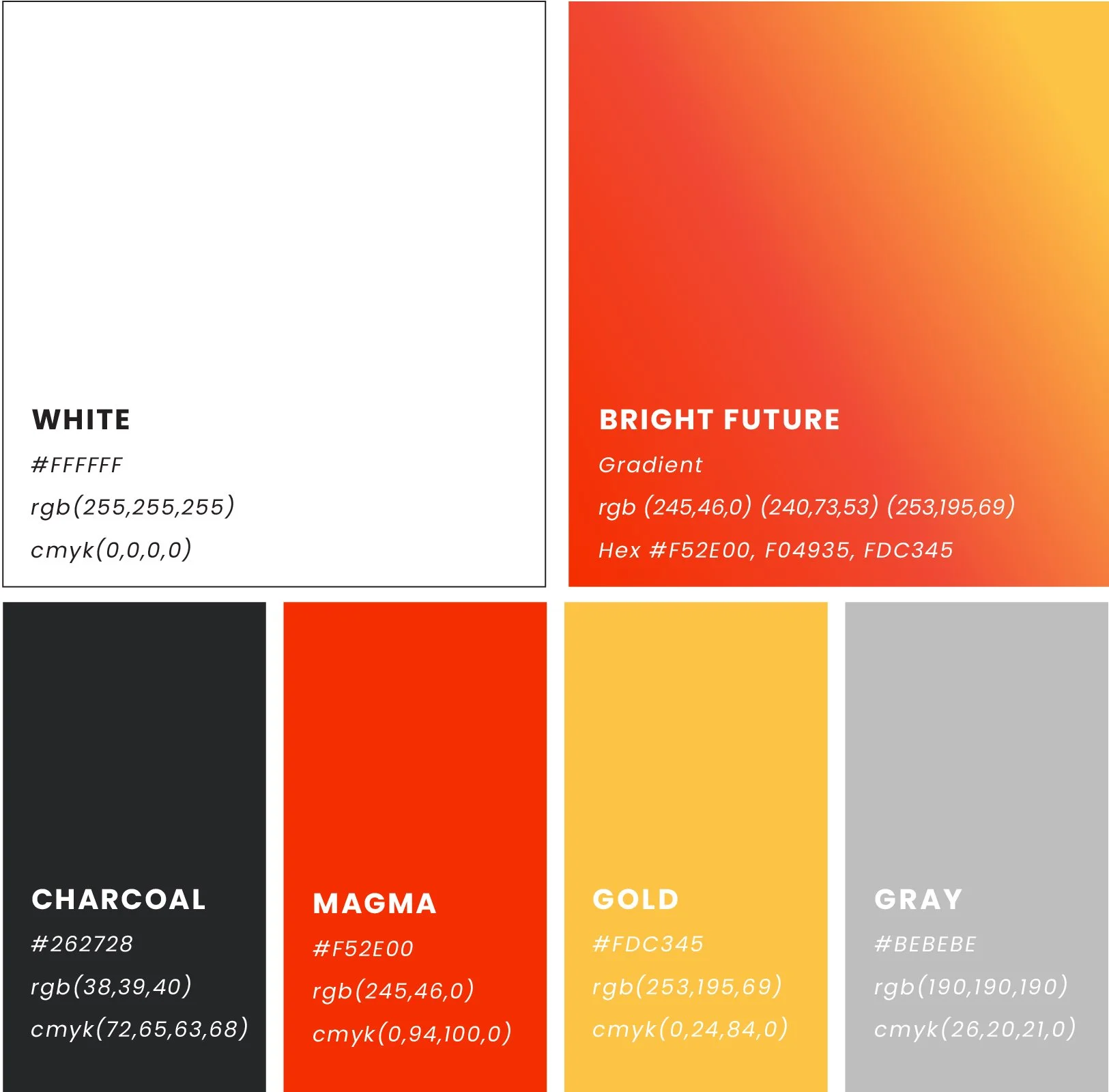
Six words were used to define the overall visual direction:
Confident, Energetic, Modern, Focused, Empowering, Approachable
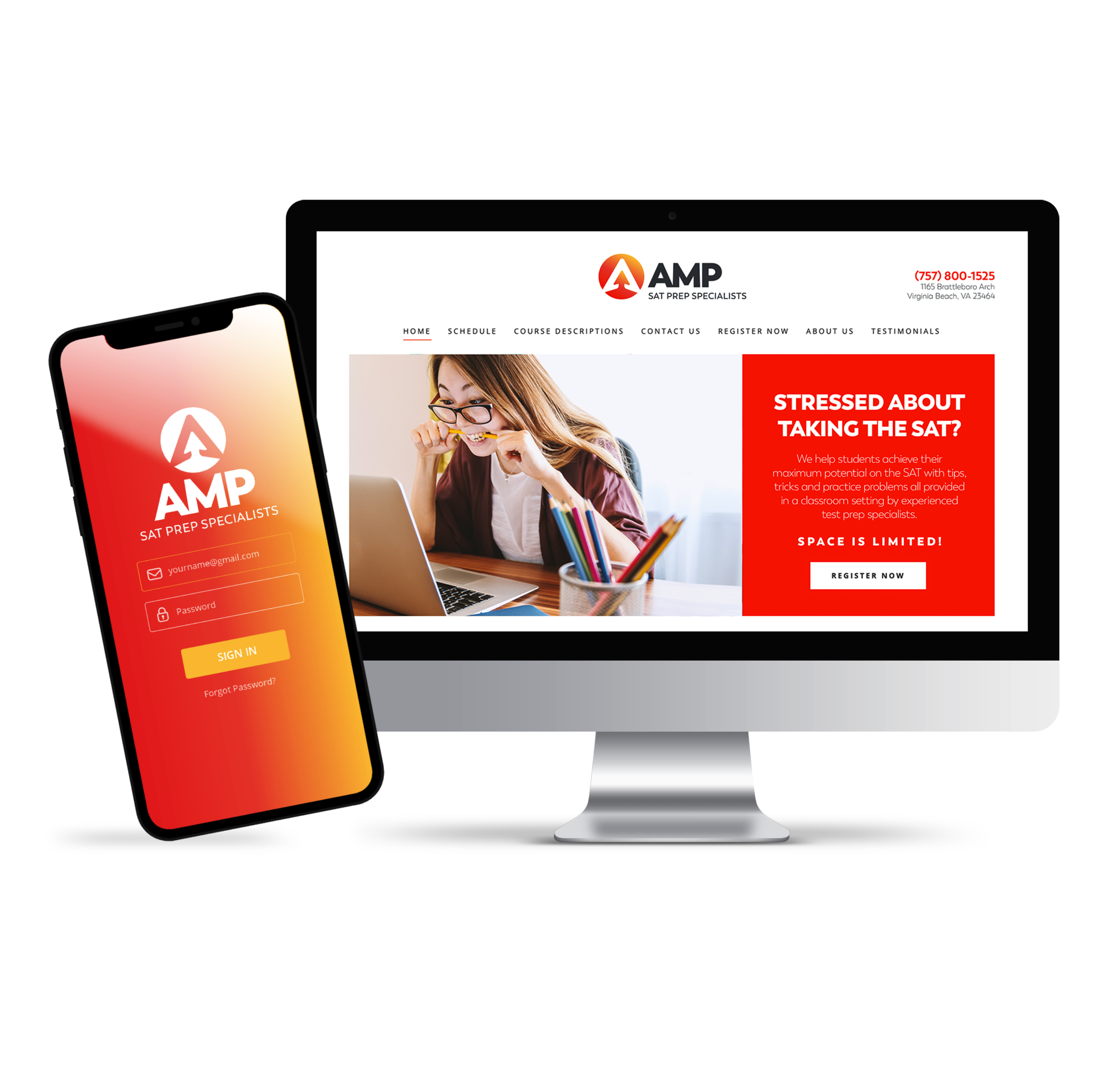
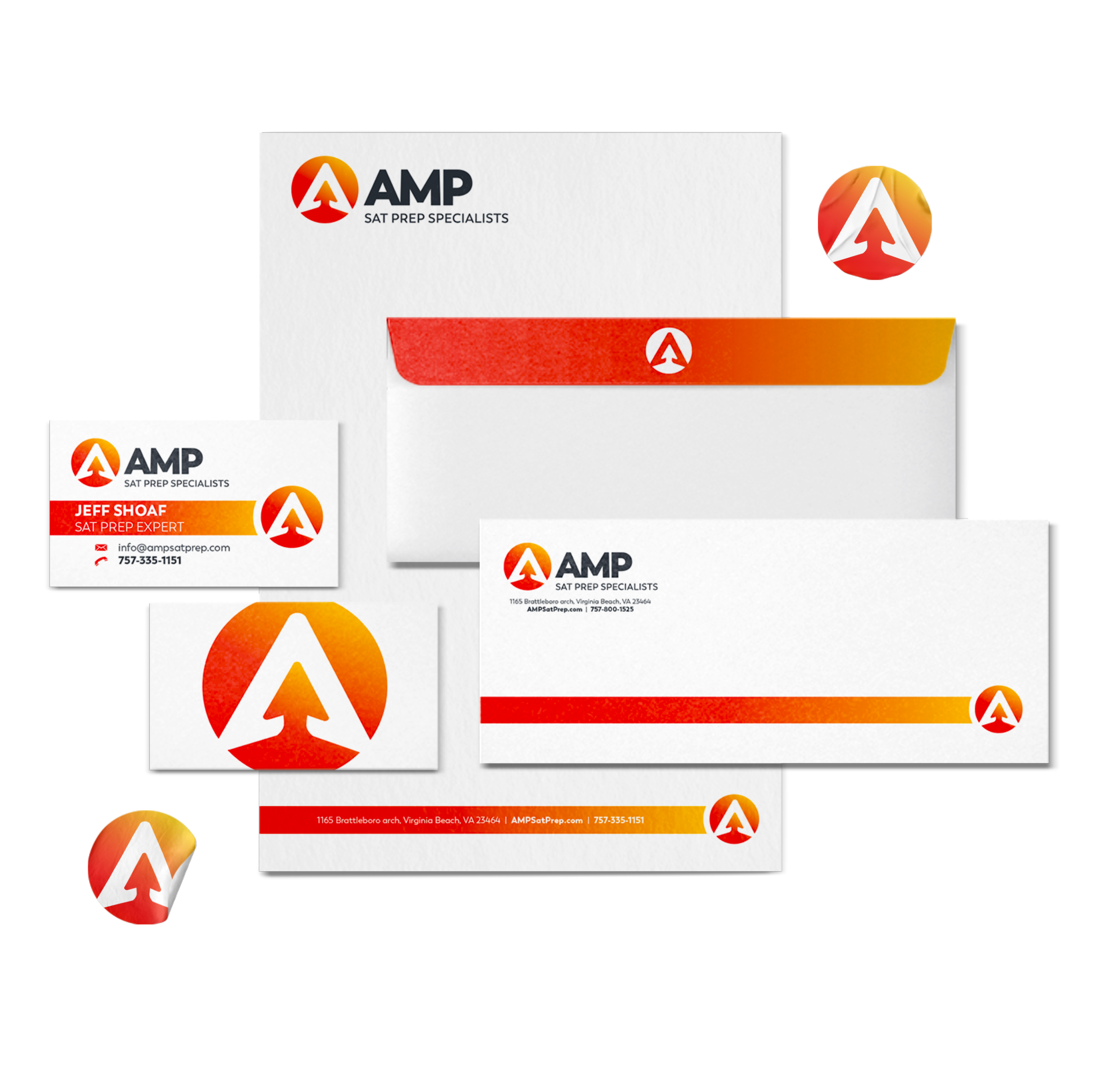
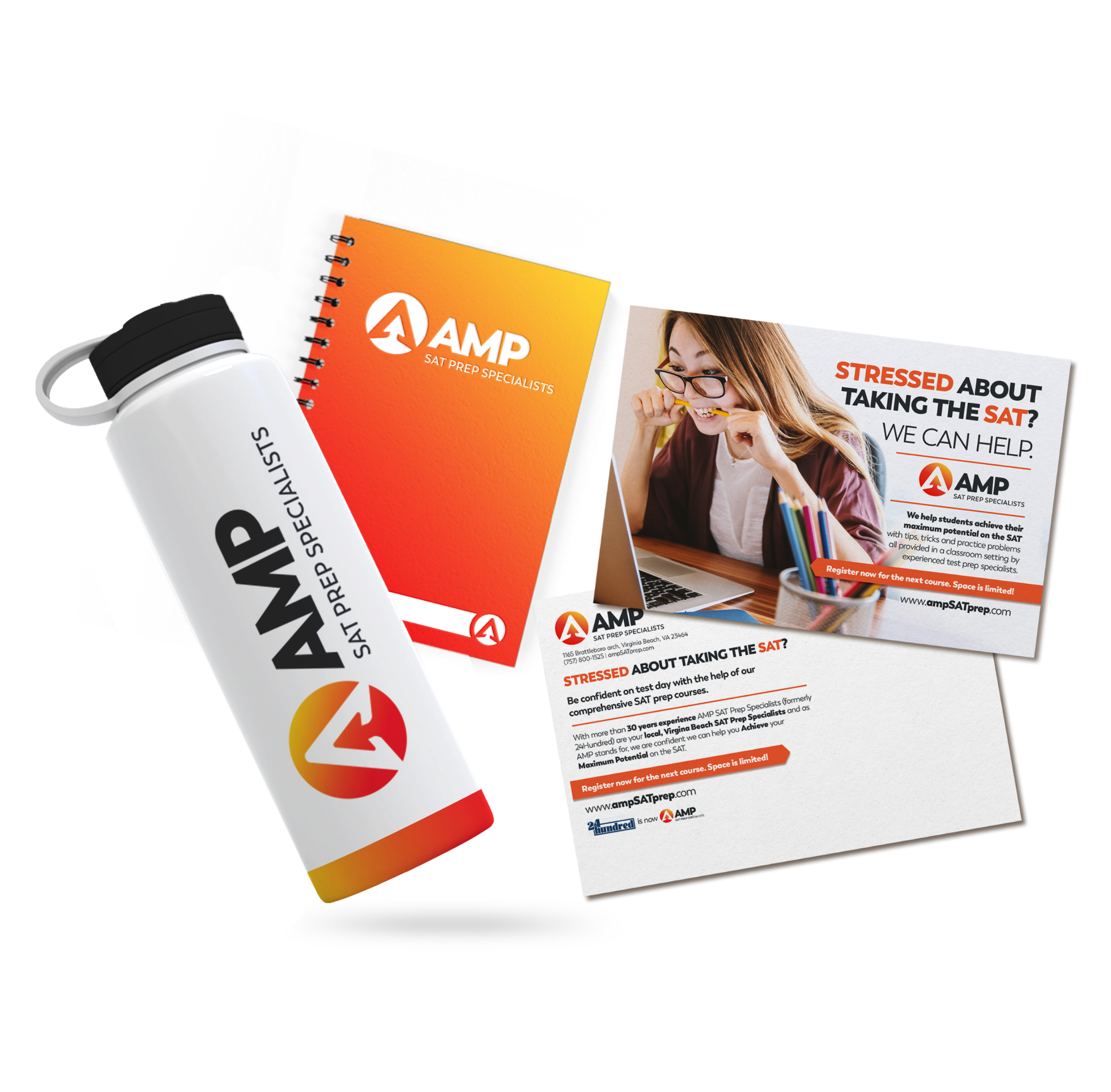
Visually, we crafted a direction that reinforced this identity through bold color gradients, energetic contrasts, and modern, approachable layouts that speak directly to students without sacrificing credibility.
The new logo and supporting graphics emphasized momentum and progress, while student-focused imagery and messaging made the brand feel motivating rather than intimidating. Clear, confident headlines replaced fear-based language, shifting the conversation from stress to preparation and performance.
Beyond the visual identity, we refined AMP’s messaging and voice to speak directly to students in a way that feels confident, clear, and human. The brand moves away from academic jargon and fear-based test prep language, replacing it with straightforward, confidence-building messaging focused on preparation and readiness. This shift positions AMP as a guide students can trust—calm, encouraging, and focused on helping them walk into test day prepared, not pressured.
The result is a confident, student-first brand identity that feels energizing and empowering while still reassuring parents. AMP is now positioned as a modern SAT prep specialist that students want to engage with, and parents trust, and the obvious choice for students who want to walk into test day fully prepared to perform at their highest level.
AMP SAT Prep went from blending in with traditional, parent-focused test prep brands to standing out as a confident, student-driven program that clearly communicates preparation, potential, and results.


RESULT
A clear, student-first brand story that positions SAT prep as preparation and potential, not pressure or fear
A confident, modern identity that resonates with students while reassuring parents
A unified visual and messaging system ready for real-world use across web, print, classroom materials, and social media
Ready for a strategic, stand-out brand of your own?